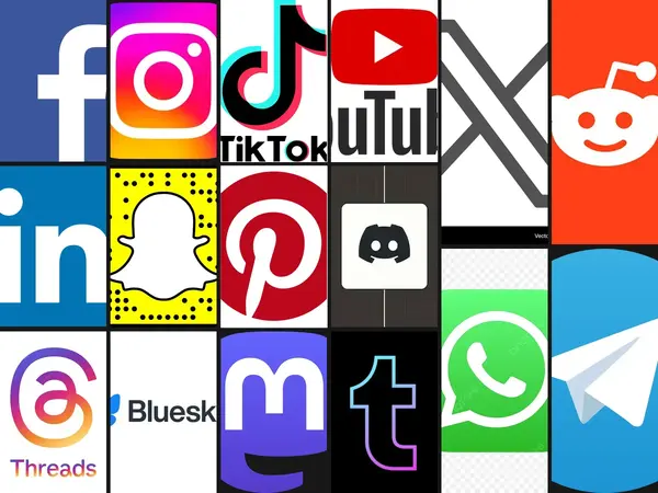
Squares you could pick out of a grid of two hundred without reading one label. Colour, shape, a single idea each.
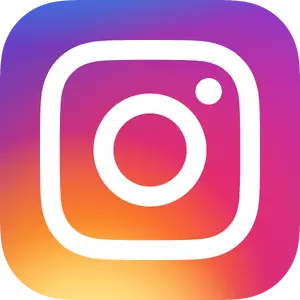 1InstagramThe camera outline on a purple-to-orange gradient, redrawn in 2016 from the original brown Polaroid.
 2TikTokThe wobbling music note with cyan and magenta fringing, designed to look like a glitching screen.
 3SnapchatThe white ghost on a yellow square, one of the few icons that never spells out its own name.
 4WhatsAppThe green speech bubble with a phone handset inside, recognisable at any size on any phone.
 5SpotifyThree curved bars on a green circle, standing in for sound waves coming out of a speaker.
 6Twitter birdThe blue silhouette that represented the platform for over a decade before the switch to X.
 7FacebookThe lowercase white f on a blue square, the most-installed icon on earth for most of the 2010s.
 8YouTubeThe white play triangle in a red rounded rectangle, now shorthand for video itself.
 9NetflixThe folded red N, a piece of the wordmark cropped down until it worked as a square.
 10Google MapsThe red location pin over crossing roads, the shape every other map app now imitates.
 11TinderThe white flame on a pink and orange gradient, an icon people recognise and still hide in a folder.
 12ShazamThe blue circle with a white S, tied to the one gesture of holding a phone up at a song.
 13Angry BirdsThe scowling red bird that turned a 2009 puzzle game into plush toys and a film franchise.
 14AirbnbThe looping Bélo mark, meant to read at once as a location pin, a heart and a person.
Comments 1
On 11 May 2016 the brown skeuomorphic camera became a pink-to-orange gradient, and the reaction was loud enough to be remembered: https://youpick.best/articles/tiktok-vs-instagram-ranked
YP
ypb-teamAug 21